Once the mechanics and electronics were working, the next step was making the box feel like something more than just a bunch of components packed into a 3D printed box.
The aesthetics, from paint and surface detail to lighting and text animations, were all used to reinforce the idea that this was a piece of advanced technology distributed by a mysterious company for classified purposes, rather than just a puzzle.
This section covers how the visual and interactive elements came together to create that feeling.
Inspiration
I really love the Alien series of movies (particularly the first and second ones) and I loved the idea of creating something that seemed like the kind of equipment Weyland Yutani would provide for staff working on the Nostromo. Looking back through the movies for some inspiration, I see the equipment having a few common traits:
- Functional but not beautiful.
- Explicitly labelled inputs/outputs and controls.
- Stencilled but minimal markings for important aspects.
- Imperfect as far as alignment of markings.
This made the Alien aesthetic even more attractive; it doesn’t require a high level of artistic ability to replicate fairly well. The key is to not try and have things perfectly aligned. I liked imagining Weyland-Yutani mass-producing these units and shipping them off to the Nostromo crew with little concern for polish.
Roughing It Up
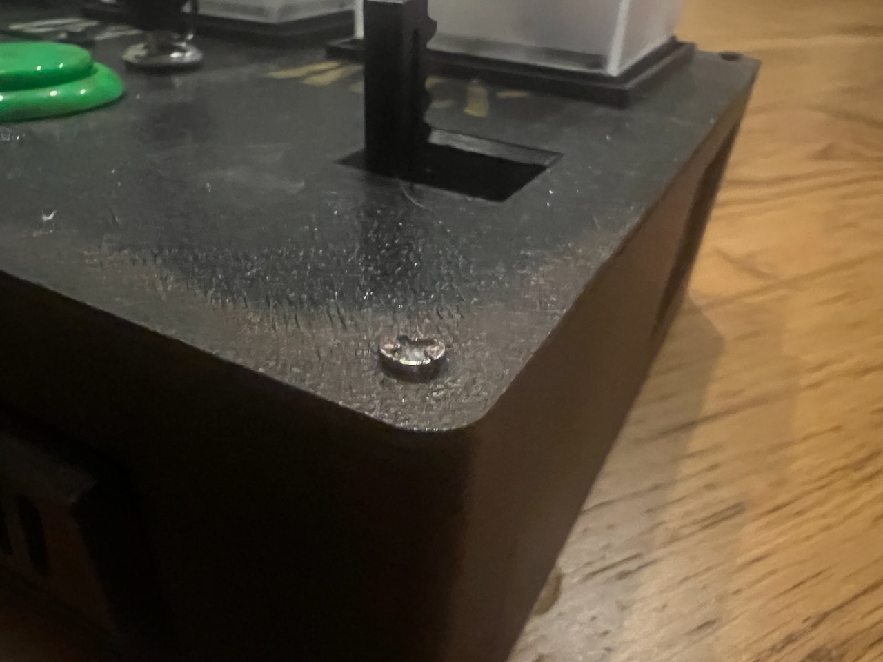
At first, I just wanted it to stop looking like a 3D printed piece of plastic. Roughing it up a bit is where I started and I just bought some burnt umber paint (it’s a dirty kind of dark brown), took a household sponge and started dabbing around corners, holes, seams and crevices to give it the look of rust and generally just being banged about.
It was important here to really not use much paint at all. It was very easy to go overboard and the moment you try “touching it up just a bit more”, it looks bad. I made that mistake a couple of times but thankfully, some black paint I had made it possible to tone things back down when I overdid it.
Frosting the Cubes
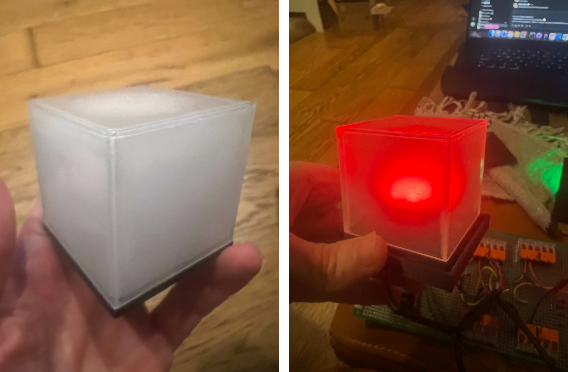
From the beginning I envisioned a type of milky white, semi-transparent cubes which would give an eerie, sci-fi glow. I looked for some cubes online but there wasn’t much in the way of pre-made ones so I decided to make my own.
I bought some transparent cubes from a 100 yen store and a can of “misting” spray which is typically used for frosting shop windows and such and gave it a go.
It was hard getting even coverage especially spraying inside the cube which I decided to do rather than spray the outside. I felt spraying the outside, the coating would come off quickly as people handled them.
Either way, they do diffuse the inside ring light as I wanted. I couldn’t get the ring light to sit perfectly at the bottom of the cube so unfortunately the light starts emitting around a third of the way up the cube. A slight compromise, but the final effect still gives them the eerie glow I was aiming for.
Aesthetic Ideas Changing the Puzzles
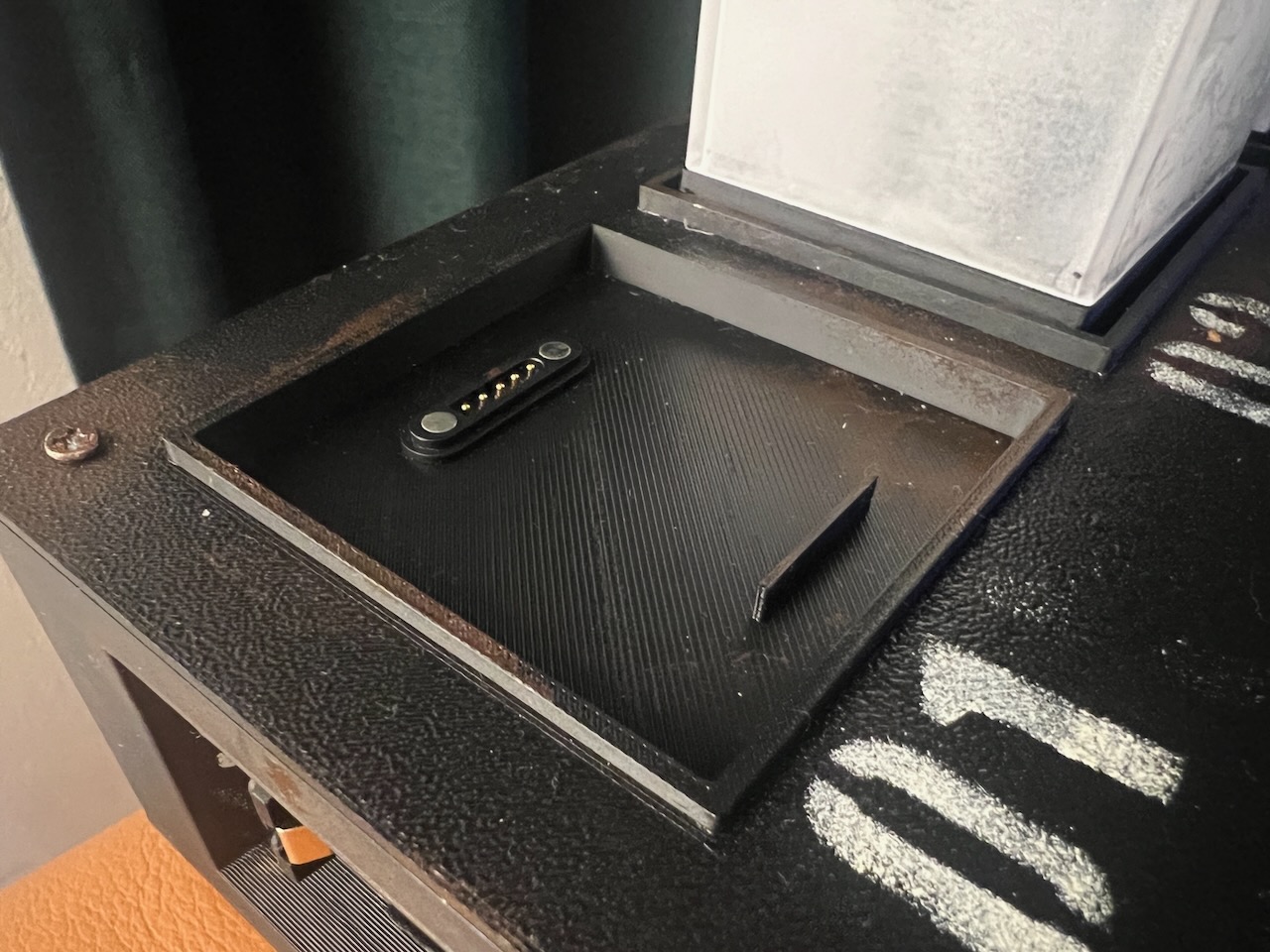
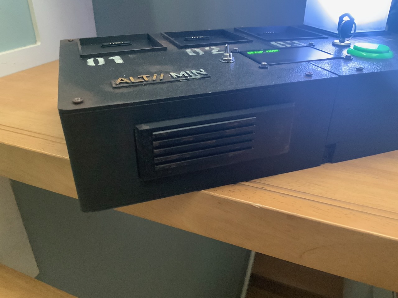
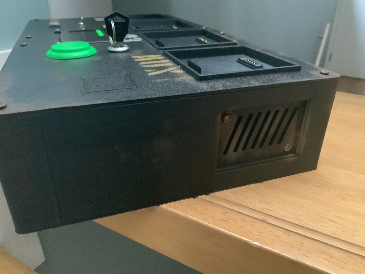
When it came to the cube sockets, I knew I wanted some kind of markings around them. At first, it was just some stripes and geometry which was inspired by the “Wipeout” Playstation games but then, looking across more Alien scenes, I had the idea to have the cubes numbered so I had the idea to add a “01”, “02”, “03”, “04” stencil to each one. That also made it much easier to communicate puzzles involving specific cubes.
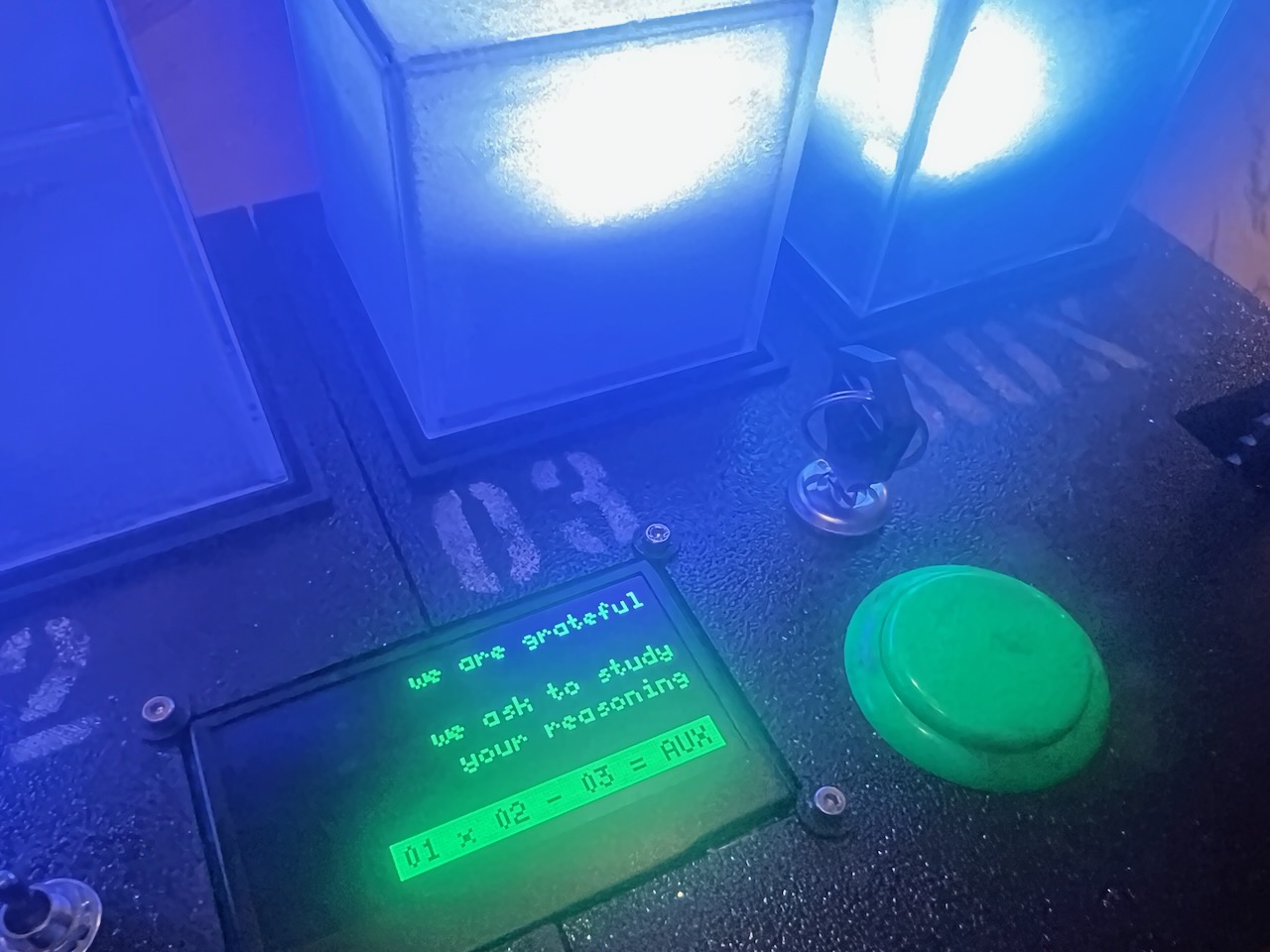
At this point though, I realised I only had two colours in the whole thing; brown for distress and white for labelling. A yellow somewhere would look cool and I thought just making socket 04 yellow for some random reason would make things look nice. But then I had the idea that it shouldn’t just be yellow, it could have a technical label instead of just “04” so I used “AUX” and that changed so much about the structure of the puzzles.
Now, I could treat the AUX cube as something “special” or a “unique” cube which played a different part in the puzzles. It opened a lot of things up and I was able to implement ideas like the formula puzzle where the display shows 01 x 02 - 03 = AUX. The four cubes flash a different amount of times and the player must move them around to make the formula correct. Put the cube which flashes 3 times in socket 01, the cube which flashes twice in 02, the cube that flashes once in 03 and the cube which flashes 5 times in AUX.
3 x 2 - 1 = 5
Fun Flourishes
Again, looking at some equipment from the Alien movies, I always liked the vents and such those items have. I also loved the opportunity to give the impression that ALT// MIN needs air vents and cooling because of the complex workings within it required to communicate with the aliens. So I built in some fake vents and heat sinks to cover up the prize drawer and such.
The Final Touch
To cap things off, I 3D printed an “ALT// MIN” badge, gave it some paint treatment (including putting the “ALT//” in yellow which worked well) and stuck it down with superglue, again not in perfect alignment with anything else. At an early stage, I wanted that to play into the puzzle, such as it being a password to enter the website but that idea eventually fell away and now it’s just a good way of adding the logo along with some verticality and layering.
These details serve no mechanical purpose, but they help sell the illusion that ALT// MIN is a real piece of functioning equipment.
In the end, these visual details did far more than decorate the box. They shaped how players interpreted it, how they interacted with it, and even how some of the puzzles evolved. More than anything else, this was the stage where ALT//MIN stopped feeling like a prototype and started feeling like a believable object from another world.